In 2019 I was approached by the BBC to interview for a Senior UX position. As part of the interview process I was asked to select a single task from a number of options.
I chose to conduct a bit of user research with my daughter (who was three at the time) and investigate what are the sticking/blocking points, if any, on the CBeeBies website.
I found this a fascinating exercise, as I could observe my daughters development as well as her problem solving skills. As you can imagine, it was quite hard not to give too much instruction, here are my findings.
Disciplines & Responsibilities:
- User Experience
- User Observation
- Product Evaluation
- Ideation
- Wireframes
- Homepage Redesign
User Research
Name:
Órla
Age:
3 Years old
Experience on touch devices:
Swiping, tap, double tap, back, drag & drop, flick,
browsing photos, YouTube and sending stickers.
Best friend:
Avery (also 3 years old)
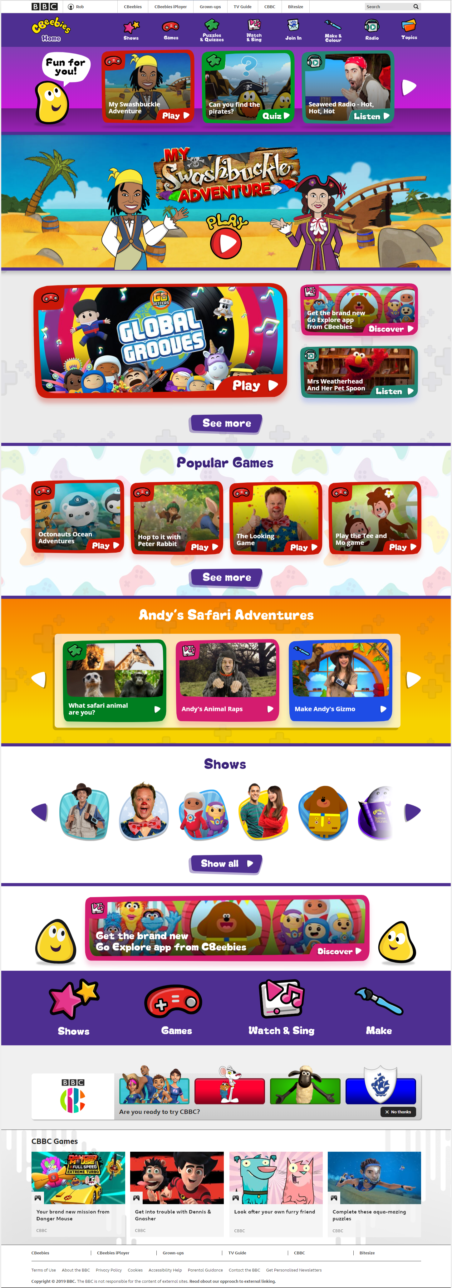
30 min session browsing CBeeBies, but mostly playing My Swashbuckle Adventure
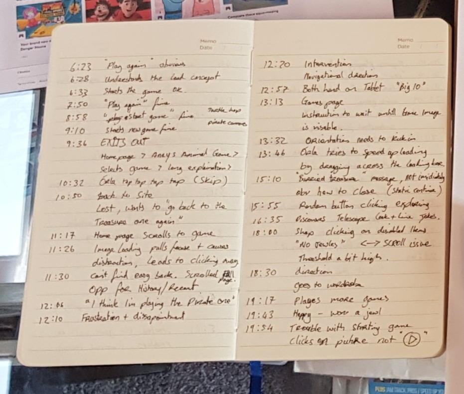
Key website observations:
- Lost: How do I go back to the game? (10m50s)
- Image loading order: Sidebar suggestion images loaded before the feature game. This lead to a click away from the desired page. (11m26s)
- Orientation detection: Message popped up even though the device was in the correct state. (13m32s)
- Site navigation: navigation was not understood.
Review the site and pick up on any other opportunities:
- Lack of history or recently viewed.
- Promotion of CBBC quite prominent. Possibly a distraction.
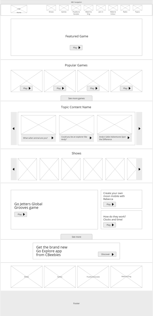
Homepage
- Lack of contrast for some CTAs.
- The variation of content was not immediately obvious.
- Sections are static, what if I don’t like Andy’s quizzes?
- Backgrounds are colourfull, but heavy and busy.
- Content for “View all” buttons could be brought into the page, it would fit within 4×4 grid.
Game Page
- Missing CTA to play game
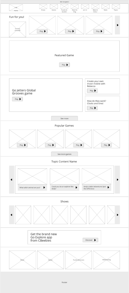
Ideation
- Simplify navigation.
- Clearly differentiate content based on type.
- Reduce cognitive overload aka space things out.
- Suggest content that the user would like.
- Surface content previously played in a section across multiple pages.
- Increase visibility of CTAs.
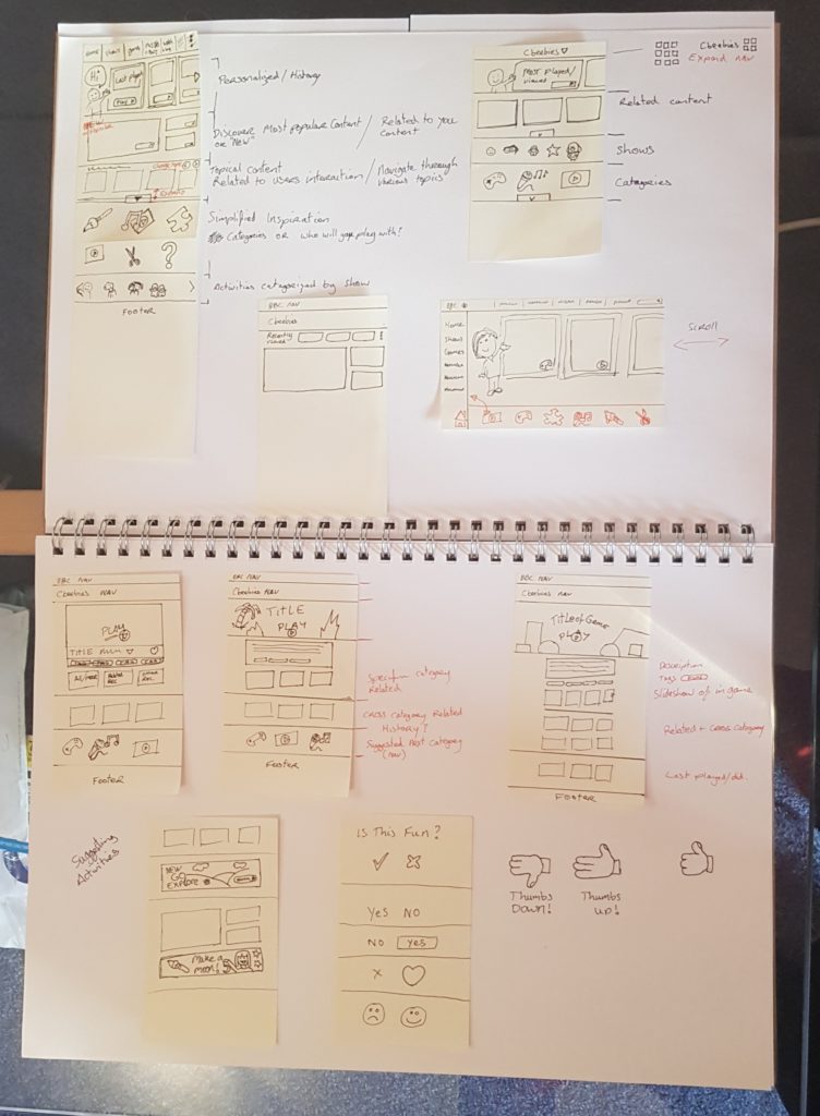
Wireframing
- Make use of GEL grid. (BBC visual guidelines)
- Comments on UXPin explaining thoughts, design decisions, interactions and content behaviour. (Unfortunately the project has now been closed)
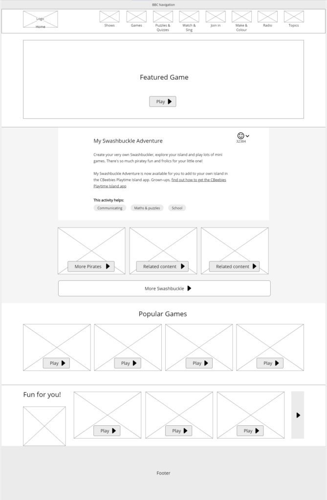
Design/Prototype
- Simplify the navigation by removing the bug (Yellow character). This will also reinforce the category icons.
- Add in bugs in various places around the page to reinforce the brand.
- Use the font Melt makes things playful and reinforces the brand.
- On the content holders, the slight reduction in structure and clean lines brings about playfulness and personality in the design.
- Reducing the complicated background images helps content to stand out.
- CTAs are clearer and will help with leading to the next action.
- Animations on interactive elements would be a welcome addition. The animations should not be a constant loop, but rather a nod to prompt an action. Animations can trigger when first appearing on the page or after a time of inactivity. This can be an effective way of onboarding when subitally done.